IMAGINE GREATER
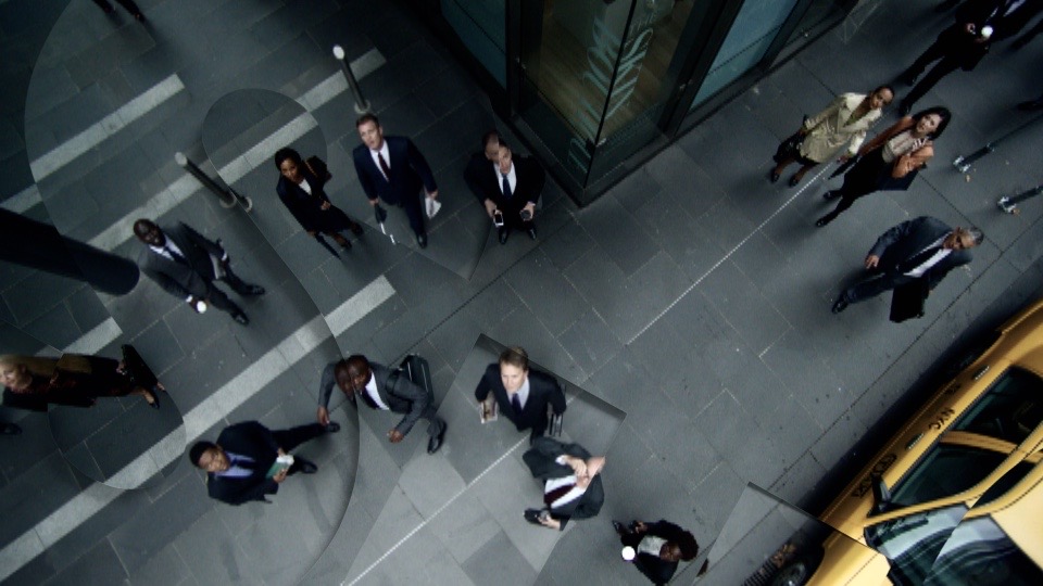
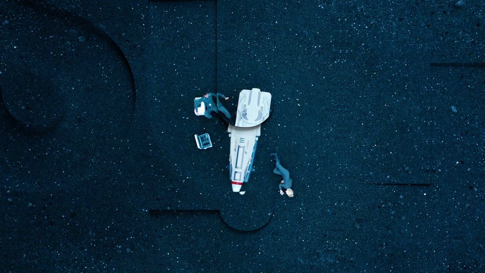
This Syfy rebrand transformed their identity from a white-controlled environment into a detailed cinematic world. This rebrand encompassed all the on-air, print, and online promotions. Syfy’s tagline is “imagine greater” and at the heart of the identity is a continually transforming logo that simultaneously emerges and recedes into living surfaces, or into the video footage itself.
Skins
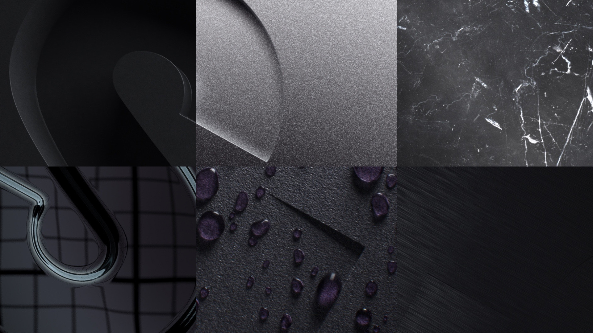
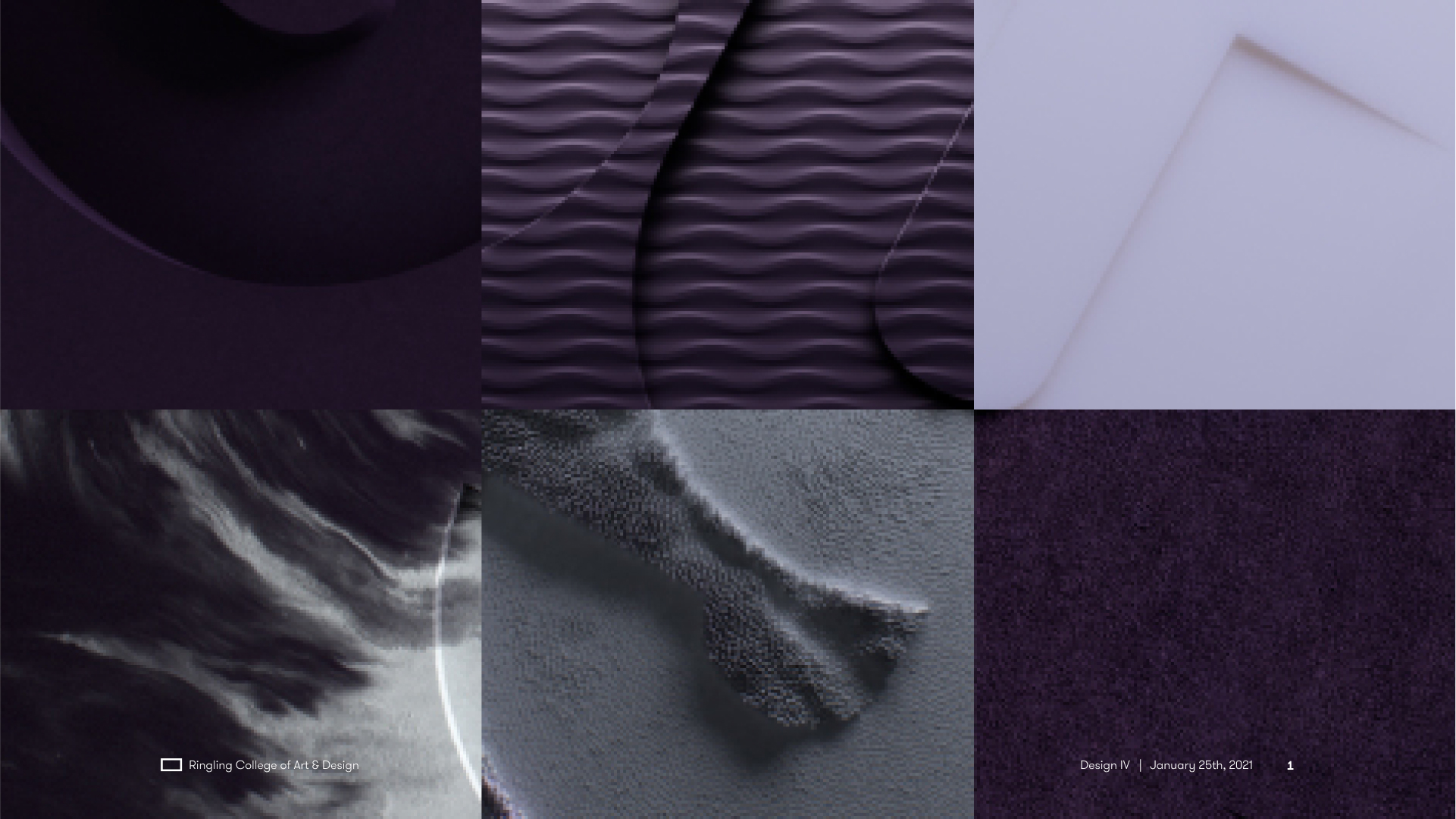
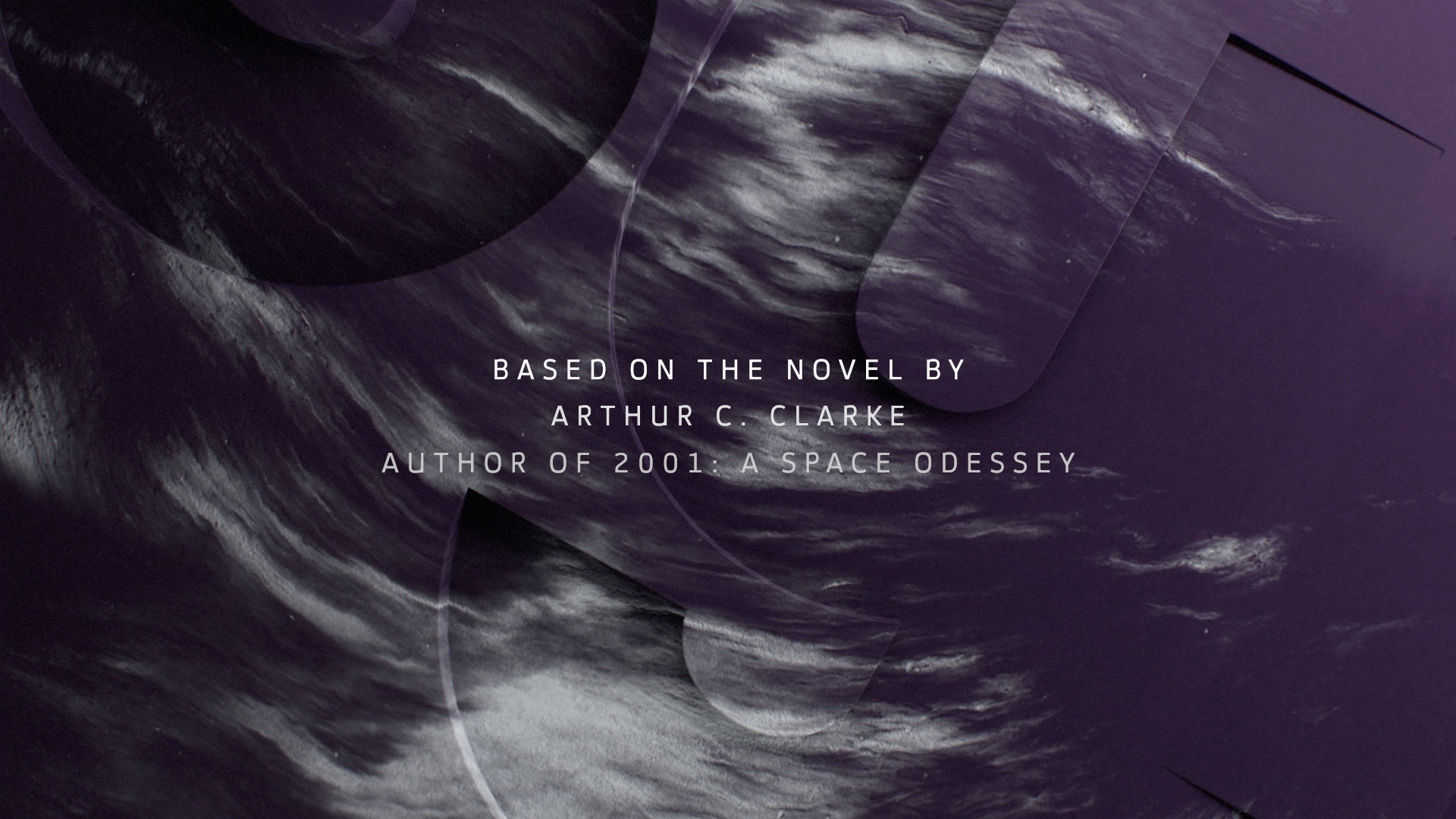
Syfy programming ranges from spaceships in the future to gladiator contests in ancient times. We carefully developed a library of physical materials (marble, felt, wax, etc.) that would allude to the scope of their programming while remaining open to interpretation. The palette of these skins also leverages Syfy’s equity in purple. In a media landscape where Syfy assets can be seen on everything from an iPhone to an Xbox, the logo “watermark” is applied to the content itself.
SYSTEM
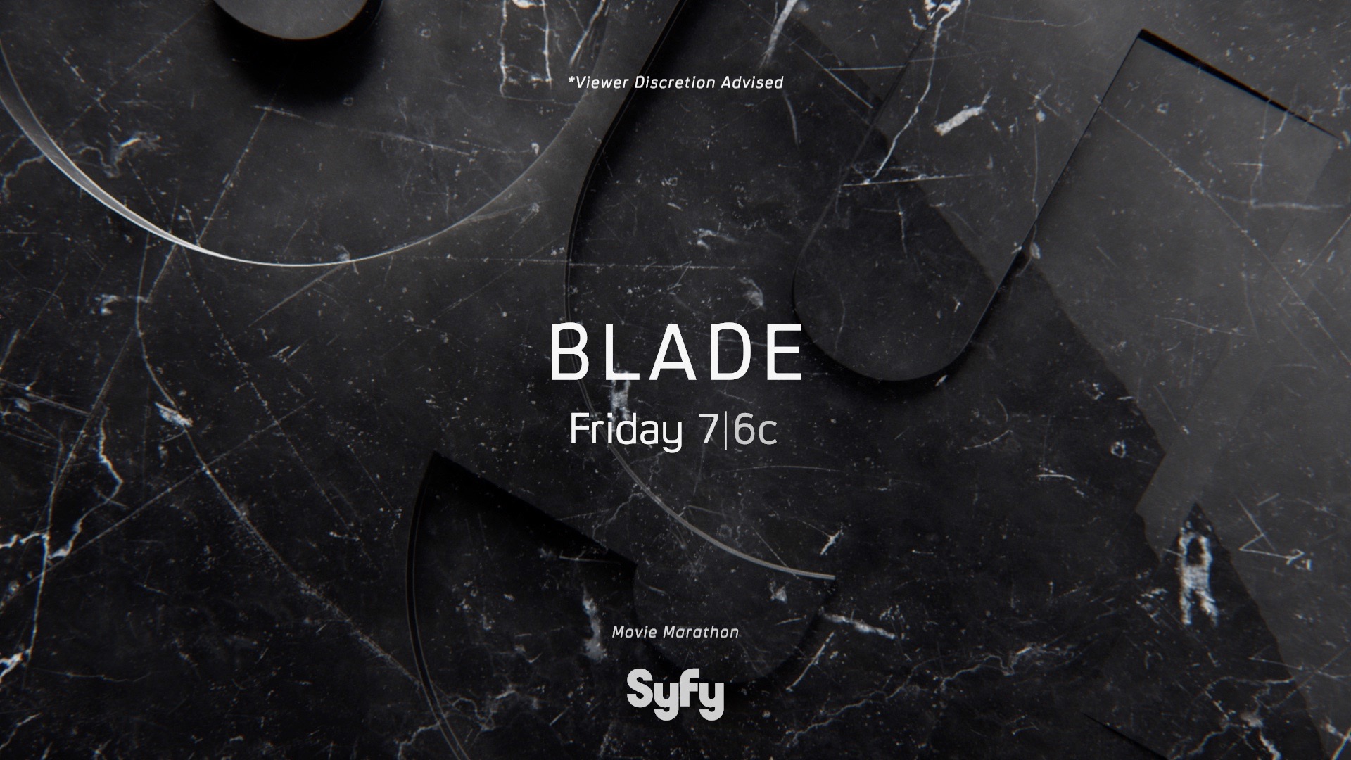
Our task was to help Syfy understand the decisions that have been made to keep the package consistent moving into the future — because they’re the ones who have to use it. The system we created for Syfy is not just a set of finished pieces, but rather a system they can use to generate content for the future. The typography is built with a simple and flexible grid. All the logo crops use 29-degree angles. There are two colors for type using one typeface at one weight and 4 sizes. There are consistent hanglines for all typography and the uncropped Syfy logo only lands in three positions.
Despite that seeming rigidity, the system is extremely flexible. These four clips share some of the first bespoke promo package produced after the rebrand, for Halloween. By changing the material of the backplates, we could achieve a completely different vibe that feels consistently on-brand.
ROLE
Design
Art Direction,
Technical Direction
Animation
Lighting / Texturing
Compositing,
Rigging
STUDIO
Sibling Rivalry

